I can memorize something better if I tell someone about it. I also see it as a sign that I’m meant to teach if I need to share knowledge in order to have it for myself. It’s a strange step up from writing it down, but since I’m also working with others (when they can) on drawn projects, there are a select few that I absolutely need to report my findings to if we are working on a team project. Even if it’s for fun, I still take it seriously; if saying I self-published before landed me the best jobs with Progenitor, then this is a project I can brag about too.
A few people and I are forming into what’s called a Doujinshi Circle and creating “Doujinshi”. It isn’t always porn and it isn’t always romance(if you’ve heard of it and don’t know this already)–it is the Japanese translation for something that is self-published or published through a private company while a manga is different in length, printing size, and is done so through a mainstream company.
As for doing a Japanese styled comic book in America, the word choice of doujinshi over comic book is mostly for the phrase and style. It’s cheaper and easier to do this style and to print at a smaller size. The contents of the pieces will have a lot more of American touches and styles in comedy or horror too. I can’t advertise projects we’ve hardly started, so there’s not much I can say at this time, but I will when more progress is made (a website is also in production, but we need a lot more content to attract viewers and show what we’re about first haha).
To save money, we are using regular printing paper, pilot gelpens and sharpies. It’s easier on us to do the lineart traditionally and then do all the tones and textures in photoshop/manga studio. With that in mind, we need to make sure we know how to be resourceful and functional.
I did the math and measured the dimensions to equal out to 5.2inX8.5in drawing space for the most accurate resize into an 5inX8in print. As you can see from the bottom left corner, 6mm were still cut off. It was measured with anticipation of losing those 6mm on the length and a little more on the width for the sake of clean cropping and the least distorted resize. A good 2 or so millimeters may be lost in the clean-cropping. Even so, this is not a major loss from the piece–knowing how much will be lost will allow me and the fellow artists to know where to put the contents to make sure nothing is accidentally cut out.
I’ve seen a few manga prints with the font falling off the page. I don’t know if it’s intentional or if it’s a printing error, but I personally find it distracting and it comes across as a poor or lazy print job. Knowing what will be trimmed off allows us to better visualize and respect the bleeding, trim and safe zones.
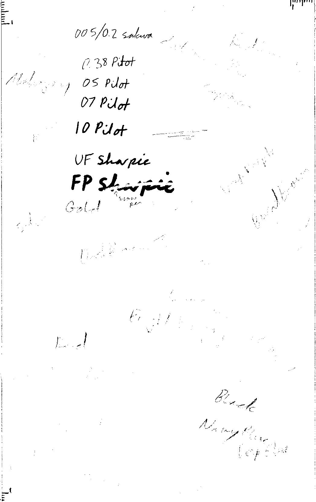
The Black and white feature isn’t perfect, but it’s easy to fix. I didn’t clean out the onyx pixels out of the pitch black ones this time (the black is just barely light or blue or purple enough to become an isolated pixel, hence the onyx versus pitch black sarcasm), mostly because this was supposed to be a quick test for the pens and sharipes to see how well they scan, register between the black&white and color scan settings and how their weight changes when printed in actual size. The quality is acceptable and it’s easy enough to clean up without being too time consuming. Doing this test first also demonstrates whether that detailed cleanup will be necessary or not.
HELPFUL TIP: Print something through a regular printer is extremely accurate to the createspace final product. The color is 99% accurate to the gloss feature, the 1% of it is not having the exact level of shine from ink versus a gross coating. Matte finish will make it about 35% lighter than what will come out of a printer, so be sure to darken the colors accordingly.
From what I saw, not only is the non-photo blue accurate to not showing when scanning black and white, but apparently a lot of my colored pencils are non-photo…
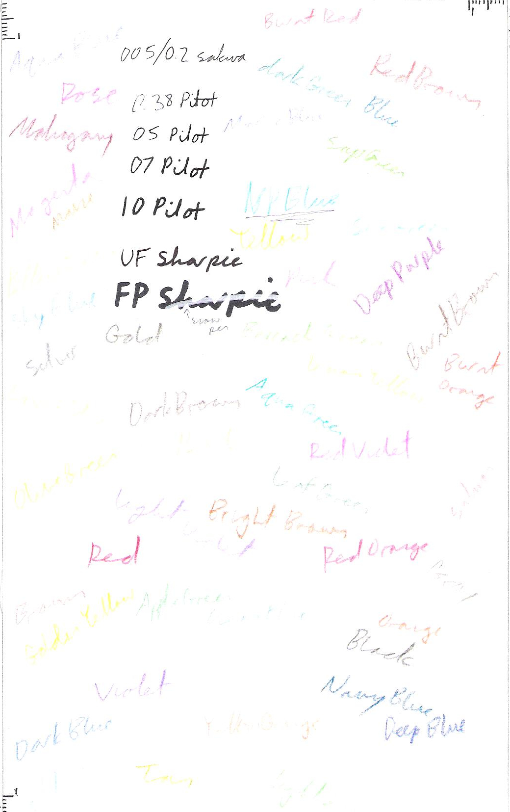
The test page itself is completely covered in the different colors, yet when I scanned it in the color setting very few showed and they appeared noisy. I was hoping to use these colors for the cover or color pages, but they didn’t show as well as I had hoped.
These are the cheapo hobby lobby brand, which may or may not explain it. I can’t afford Prismacolor and I also tend to have trouble sharpening pencils of any kind as it is, no matter how careful and gentle I am. This is also an older printer/scanner, which may also explain a little bit of it to.
However, my main concern was the pens and sharpies being scanned in the black and white setting. It’s possible that I would just need to use watercolor pencils instead.
I don’t have the money for my own scanner or to go somewhere to pay for use of a scanner, so I’m checking out what I have available around me.
This also tells me what I may or may not be able to do for submitting art to Progenitor, but I may just pay for a better scan job for a literary magazine entry or two or three.
Please let me know if there’s anything else you’d like to see.
I may take all my notes from doing this and format it into a guide from createspace. If I do, I’ll post about it. Let me know what questions you may have regarding this particular subject and it may end up in a printed book.
